Designed at BERG, 2010
Matt was lead designer for Schooloscope, a website that made UK schools data easier to read.
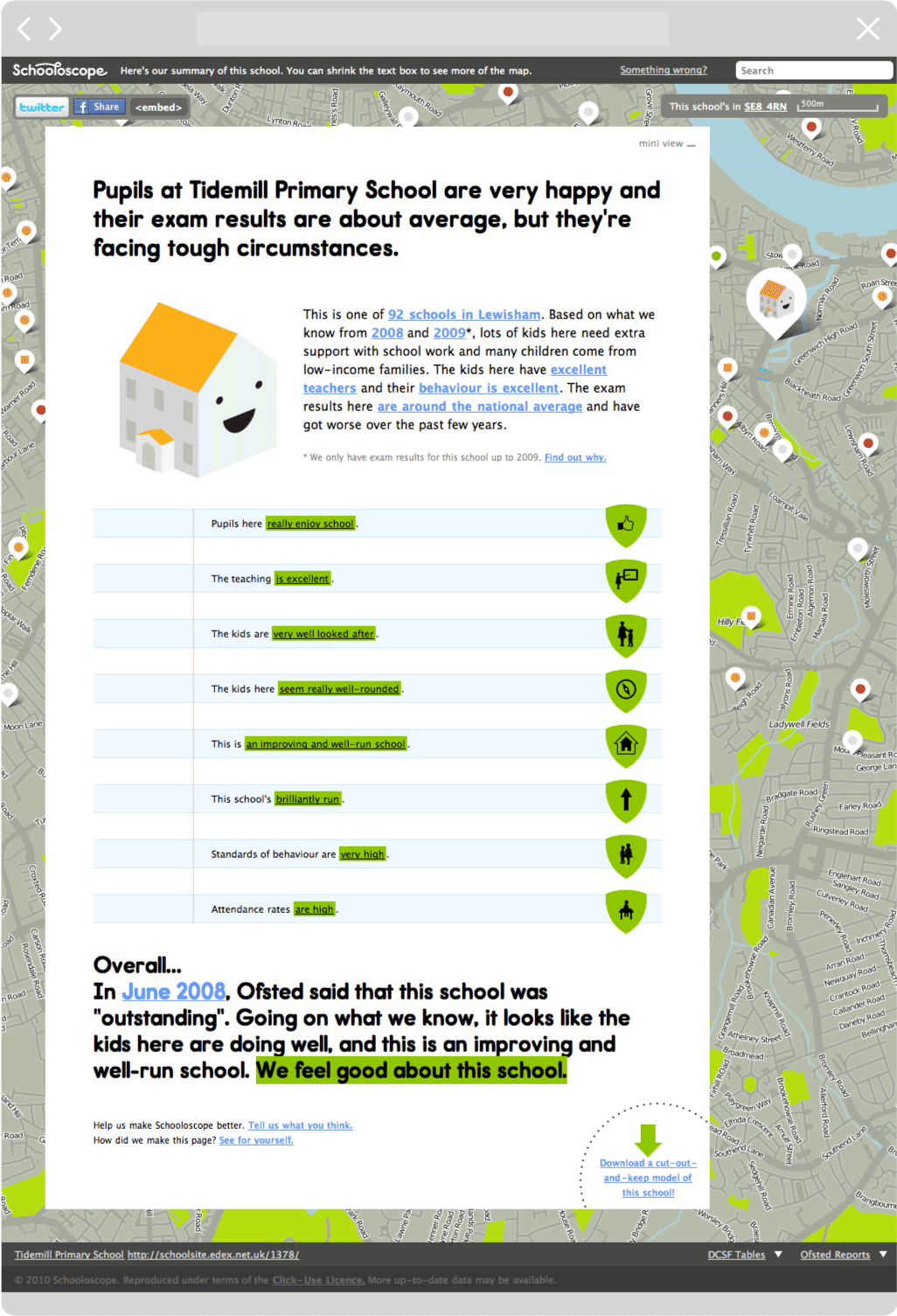
From dry data to simple sentences
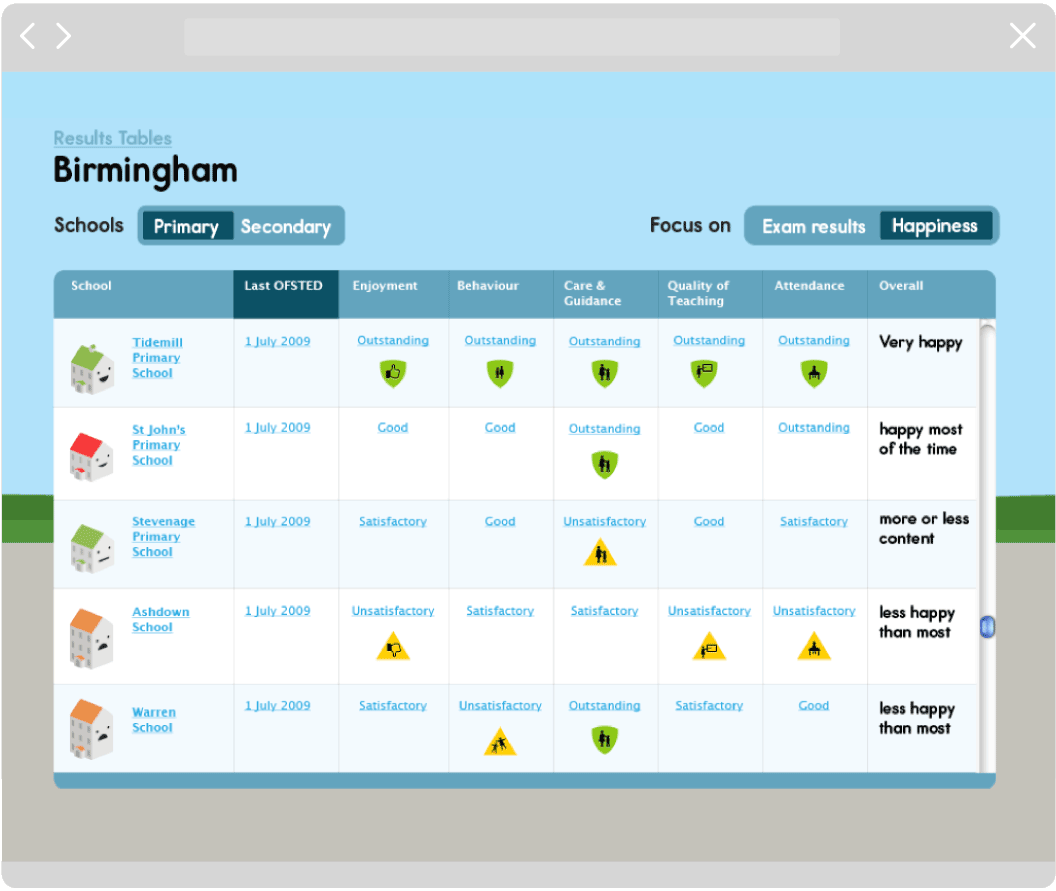
Nearly every school in England had its own page on Schooloscope, which was generated from publicly-available data, such as Ofsted reports and performance tables. Schooloscope distilled this dry, numerical data into a set of simple, conversational phrases.
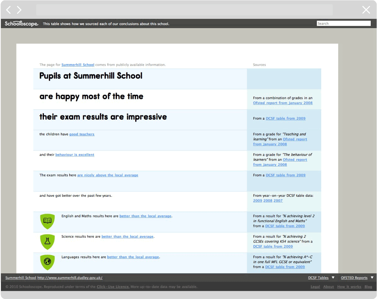
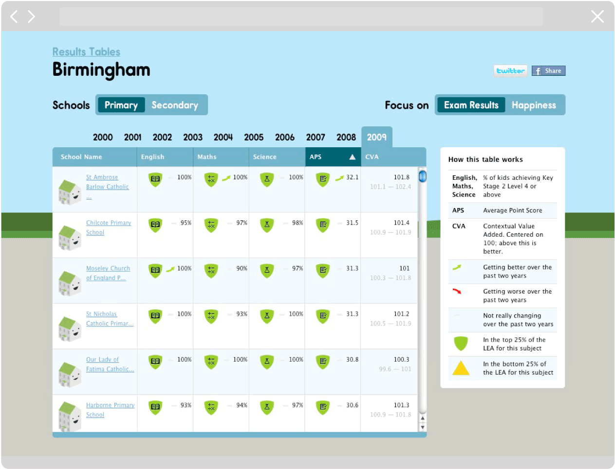
‘Show your working’
Each school page also showed how it was generated, allowing parents and kids to explore its source data and how it was interpreted.
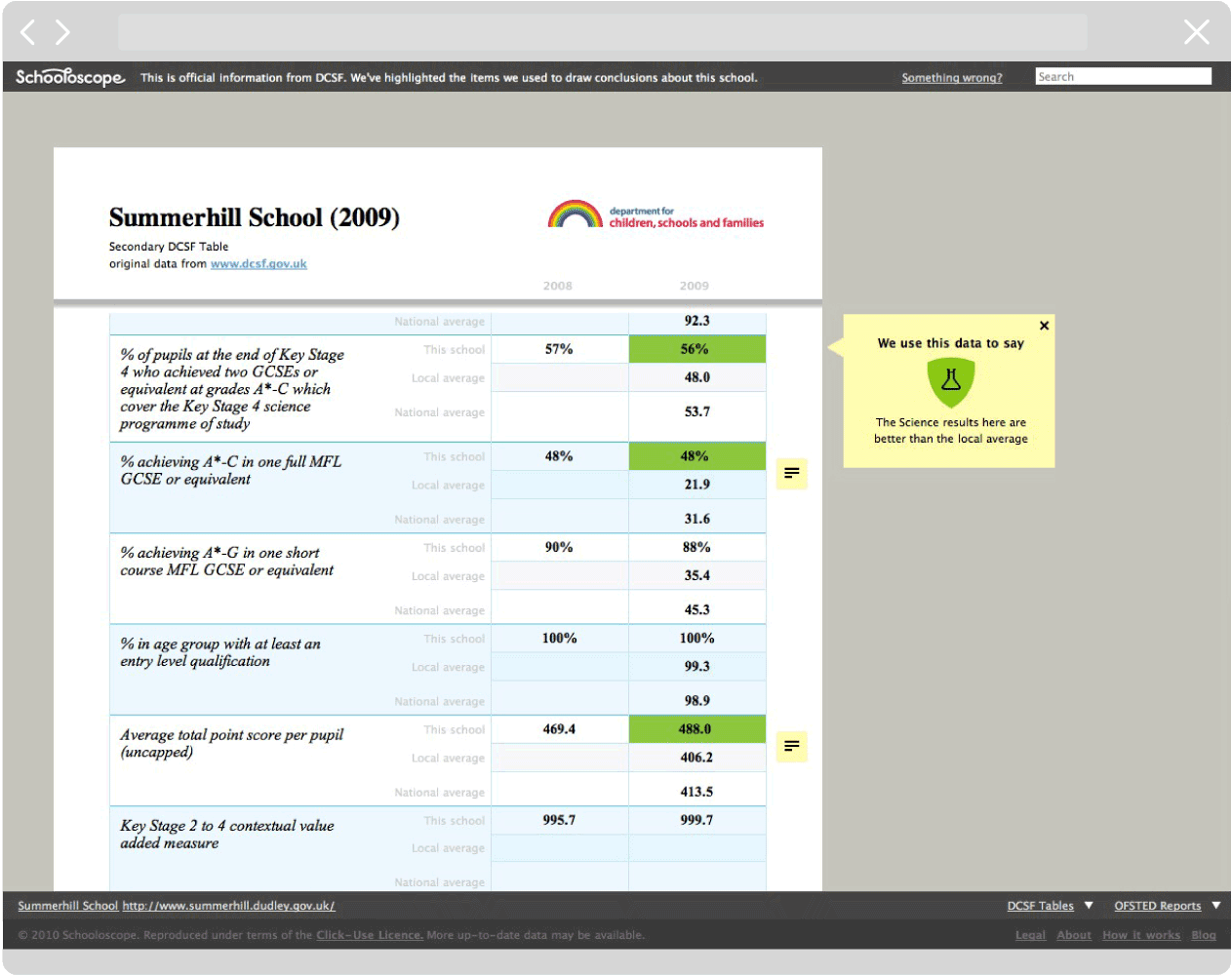
The whole site floated on top of a map, to allow for easier search, comparison and serendipitous wandering.
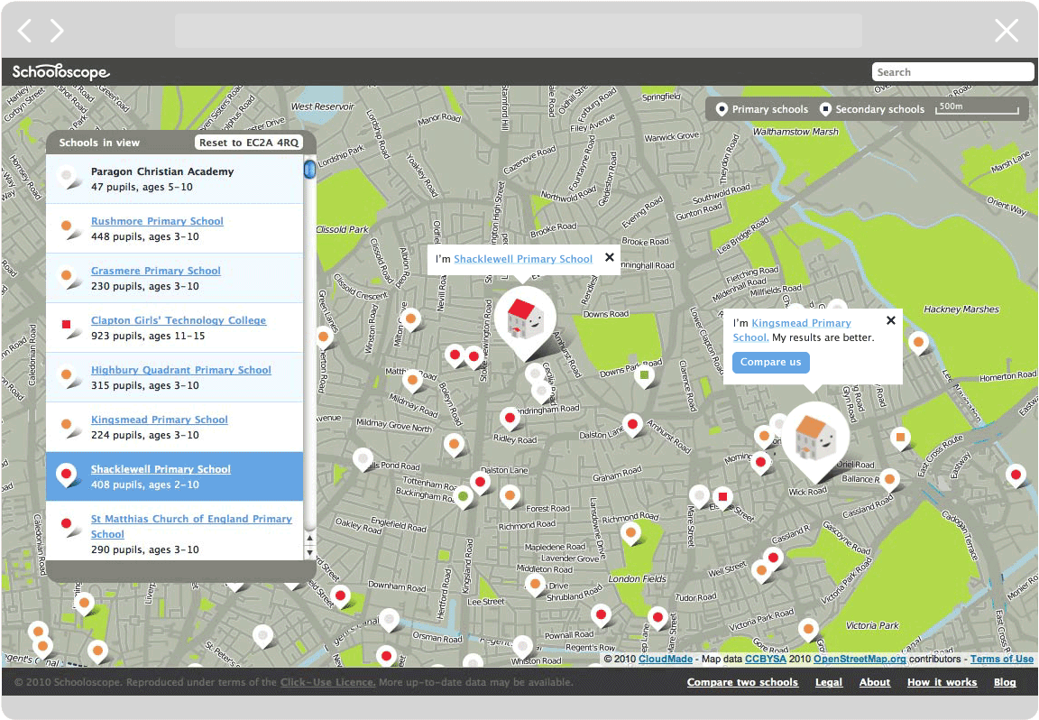
‘Chernoff Schools’
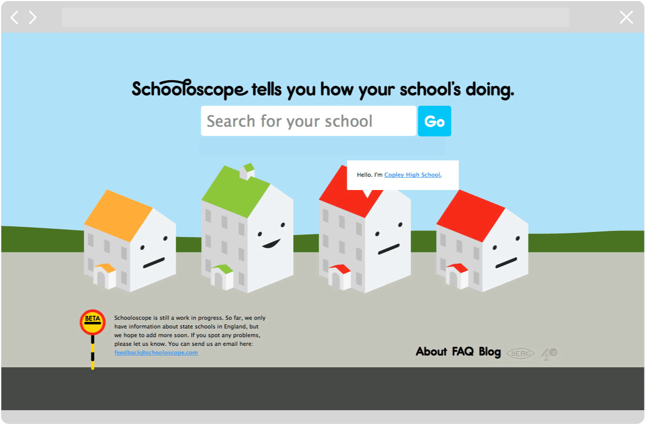
Each school was also represented by an icon – a little school with a face on it. This was also generated from publicly-available data: the number of pupils (building size), academic performance (roof color), and ‘happiness’ (facial expression), which was derived from data about pastoral care, pupil enjoyment, and behavior.
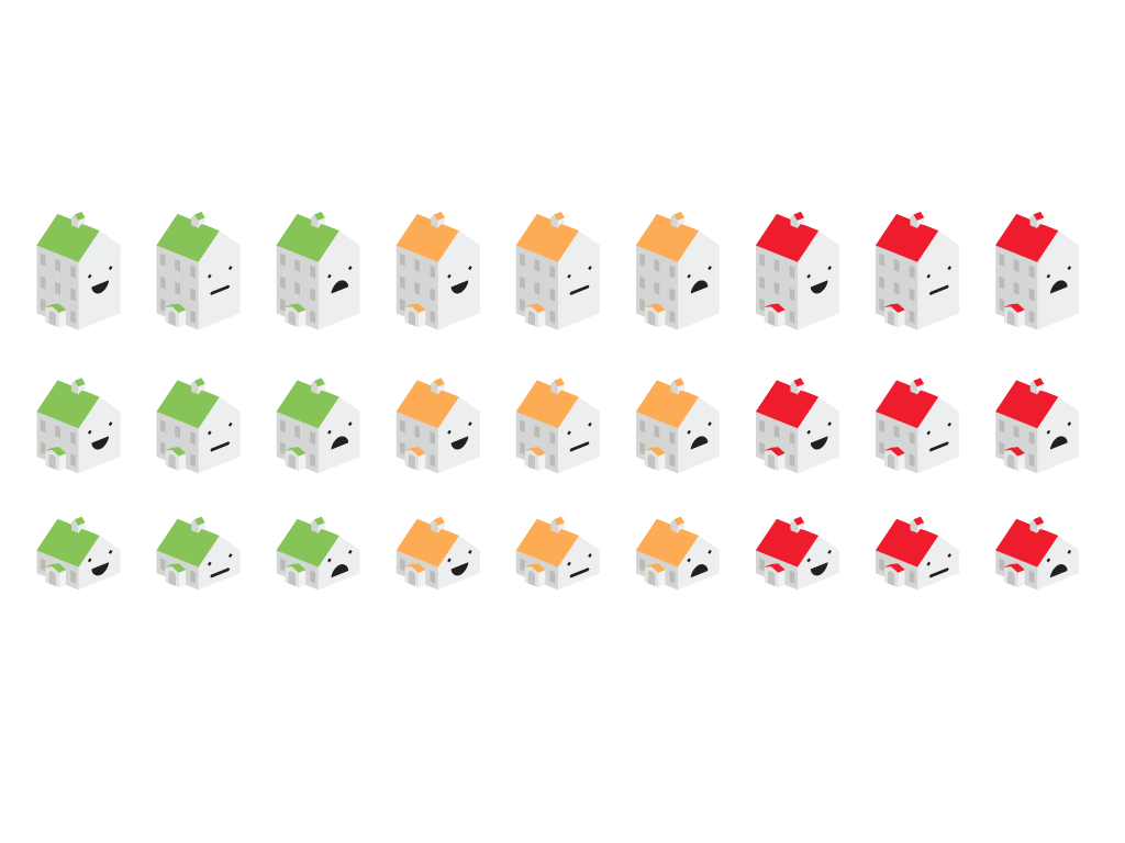
This technique was borrowed and adapted from statistician Herman Chernoff, who pioneered visualising datasets using human features in the 1970s.
More than academic results
Schooloscope aimed to show that a school is more than just a set of test scores – that kids’ happiness and enjoyment is just as important as their academic results.

Literacy in data
Schooloscope ran from 2010-2012, and became a model for how open information and thoughtful design could help people become more literate in the public data that affects everyday life.