November 2022
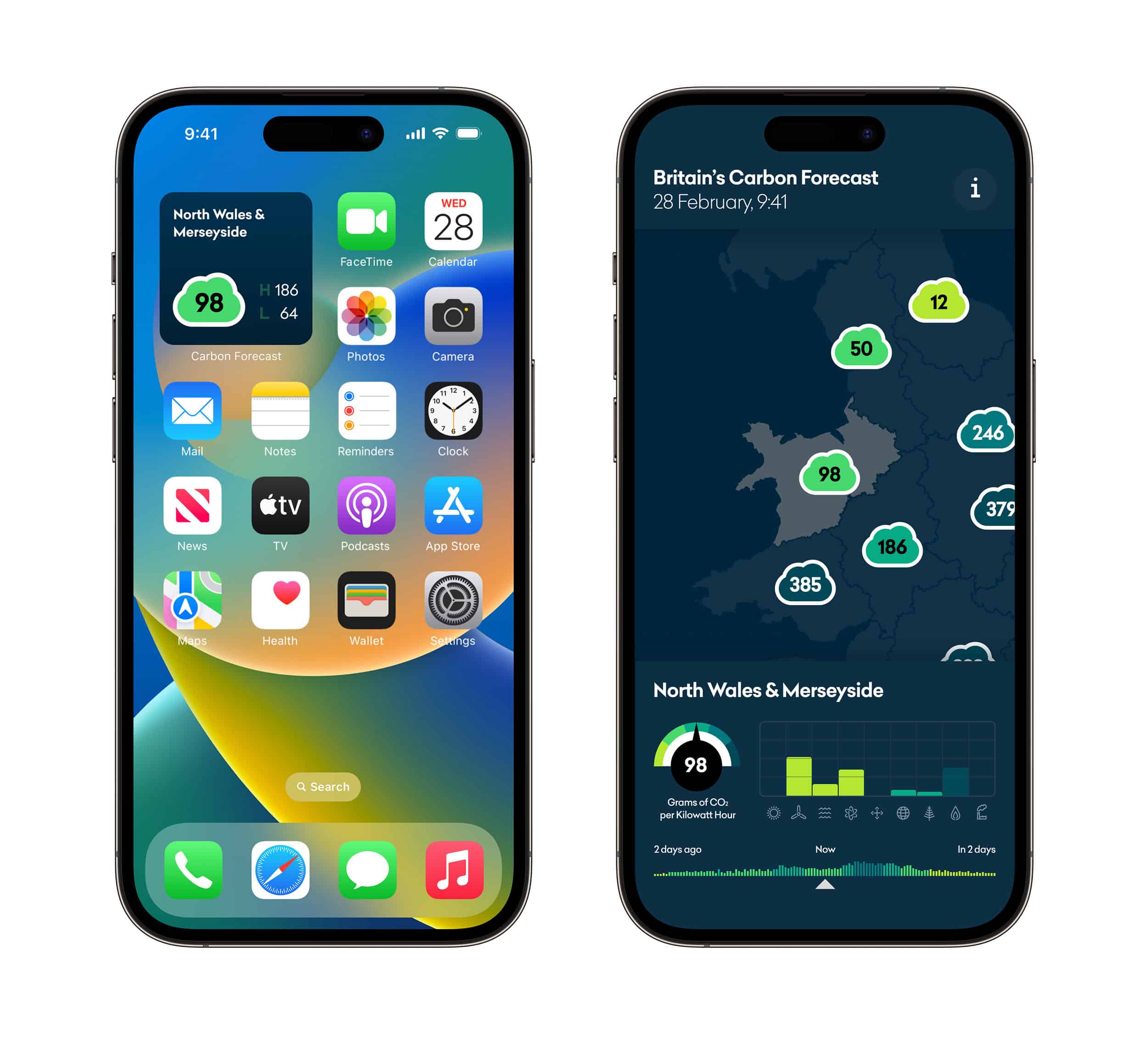
What if we chatted about carbon emissions like we chat about the weather? If we knew a bit more about where our electricity comes from each day, would that change how we use it? What if the numbers, scales and ranges became more familiar, and less like scientific jargon? This prototype uses data from the brilliant carbonintensity.org.uk to imagine a daily Carbon Forecast for Britain.
Best enjoyed on large screens, in landscape format.
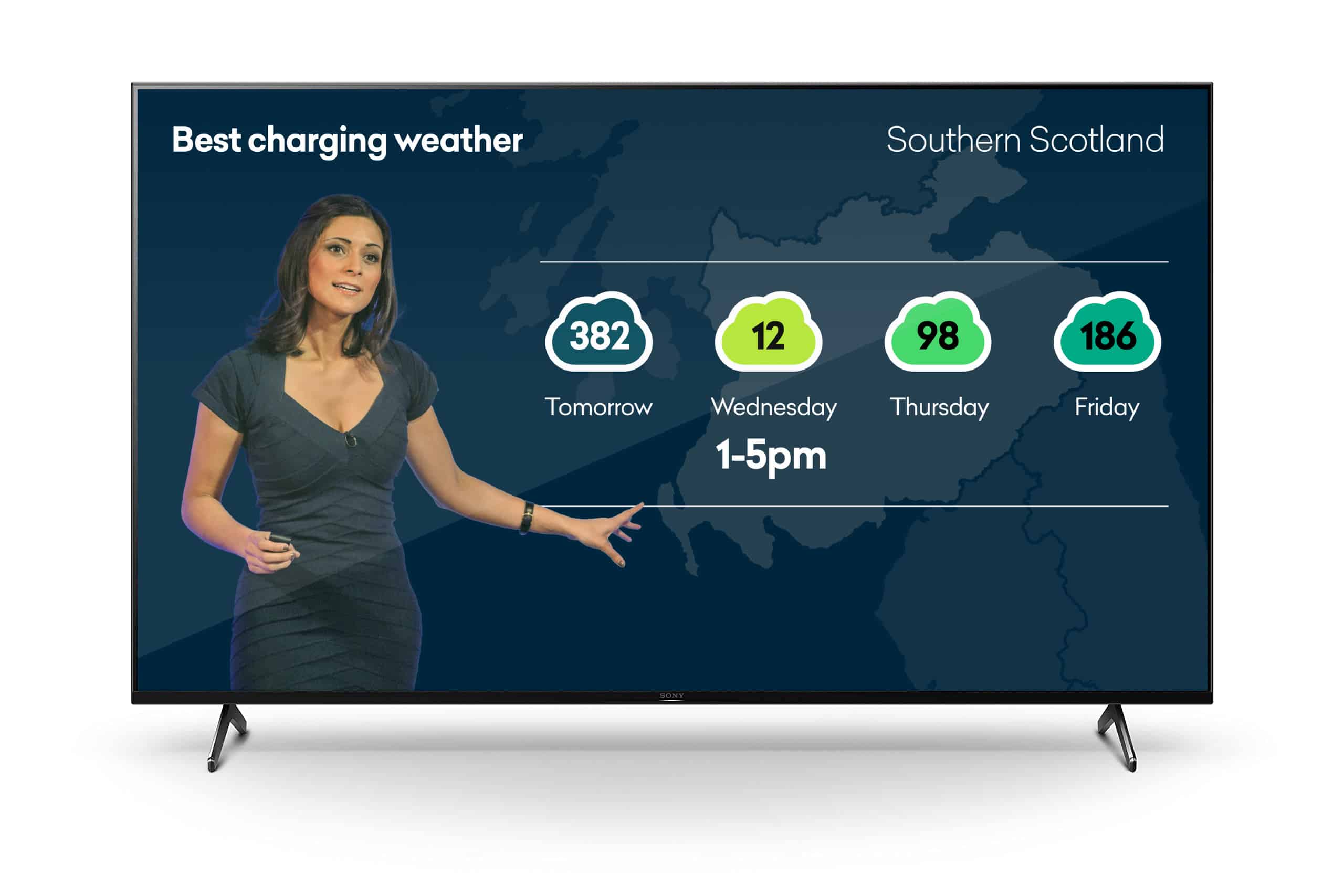
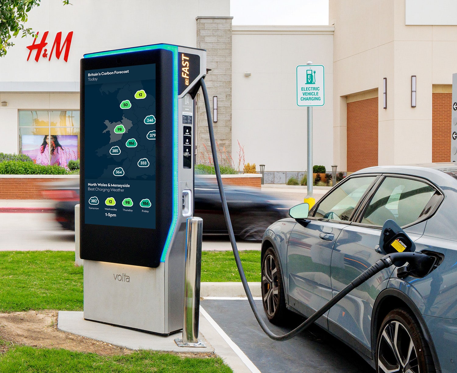
The prototype is designed for desktop, but it’s easy to imagine other surfaces and touchpoints we’d need – from homescreen widgets to TV weather broadcasts, or displays near points of use like public chargers.


One of design’s most important roles has always been to make the new and unfamiliar more intelligible and approachable. If we can help promote more everyday literacy around carbon intensity, we might be able to help encourage everyday behavior change.
Best enjoyed on large screens, in landscape format.
Seeing CO2, Feeling kWh
Most Brits could tell you what 20 degrees Celsius feels like—what about 200 grams of CO2 per kilowatt hour? What everyday analogies might make this simpler to talk about? In Britain, household chores are often linked to the changeable weather, so the prototype also has a tiny interactive diagram showing how much CO2 is generated by an hour of tumbledryer use at different levels of carbon intensity.
Best enjoyed on large screens, in landscape format.
Making as Thinking
We do small studio projects like this to explore ideas, practice craft, and have fun. If you’d like to know more about the studio, discuss a project, or just say hello, get in touch.