I’m off to Washington DC next week for a workshop hosted by the Office of Educational Technology and the Data Quality Campaign. The goal is to help states meet the requirements of the 2015 Every Student Succeeds Act (ESSA), by making school data more accessible and family-friendly.
Sounds familiar!

Almost exactly 9 years ago, I joined BERG to lead the design of what would become Schooloscope. From where we are today, the world of 2009 feels like another planet, but our goal then was exactly the same as it is this week – to help parents understand how their local schools are doing.
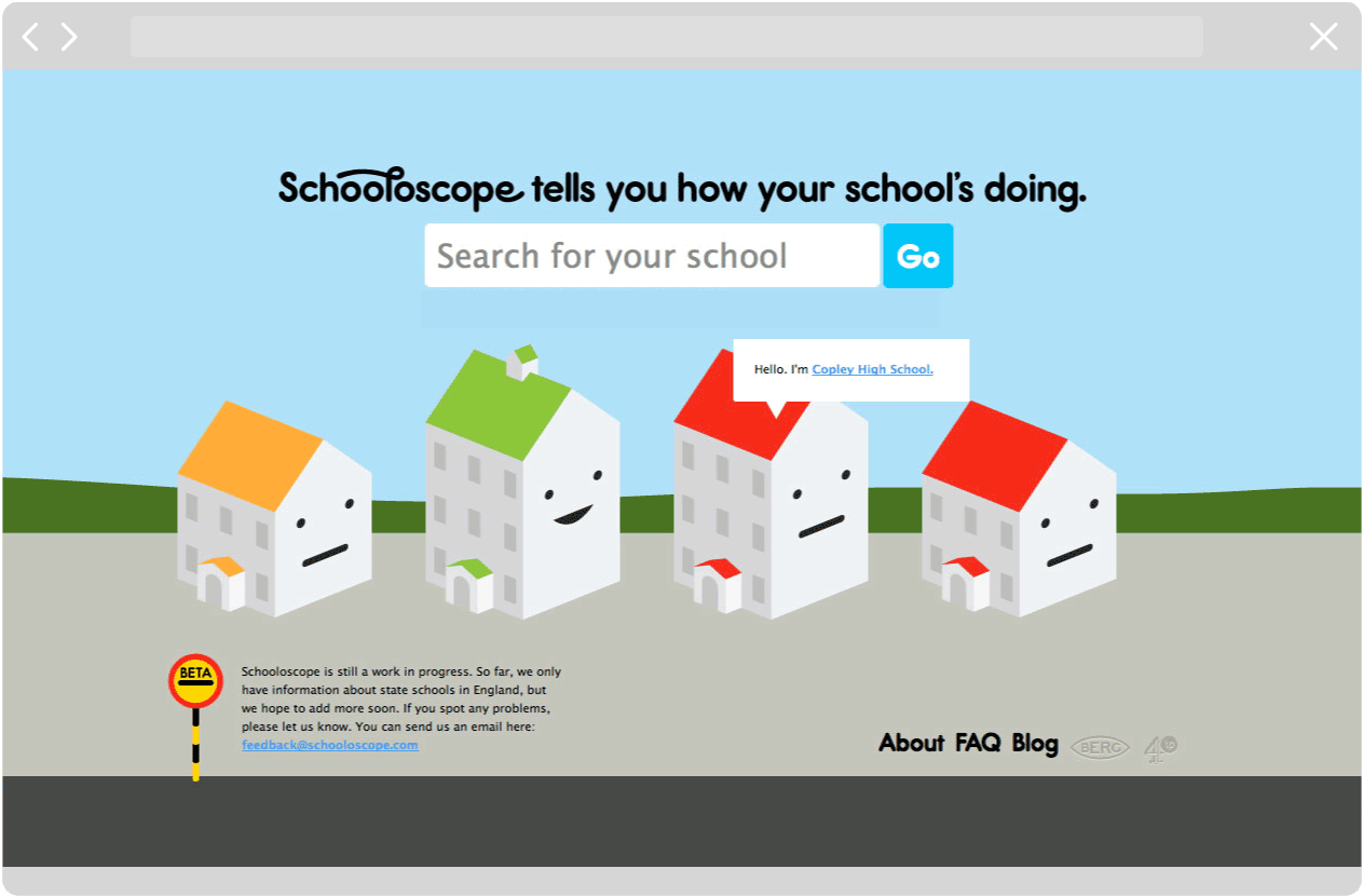
We worked on the launch version of Schooloscope for about 6 months, so there’s a huge amount of learning I can (hopefully) bring with me to next week’s two-day workshop. Here are a few aspects of our design process as I remember it. (Usual hindsight caveats apply!)
Dataviz as Pop Culture
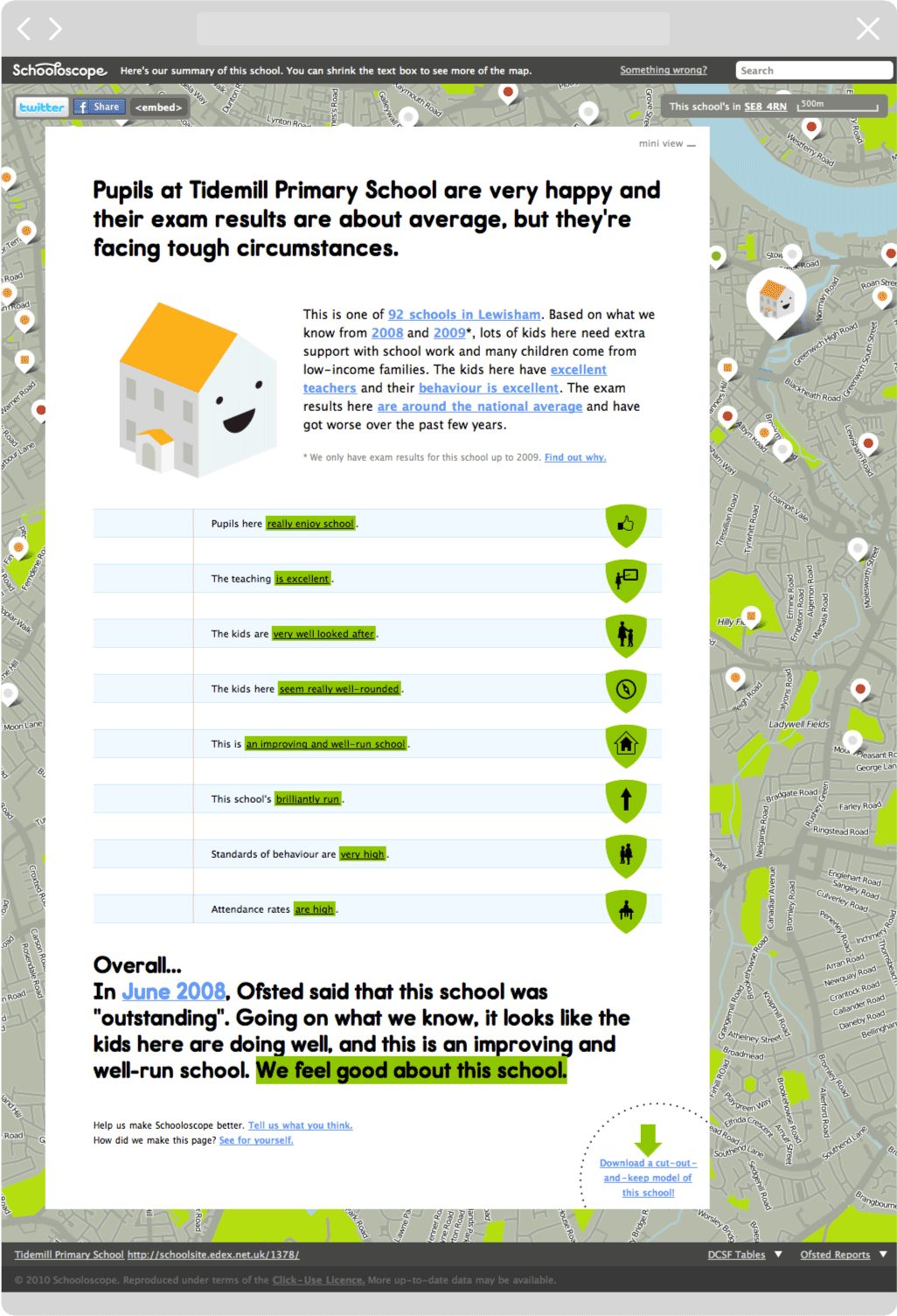
One of the challenges we set ourselves was to design for parents who weren’t familiar with dry, scientific charts and graphs. Riffing on the visual language of things like Top Trumps, sports graphics on TV, and drive-thru menus, we aimed to make Schooloscope feel as approachable as reading the back of the cereal box over breakfast.
Conversation-First
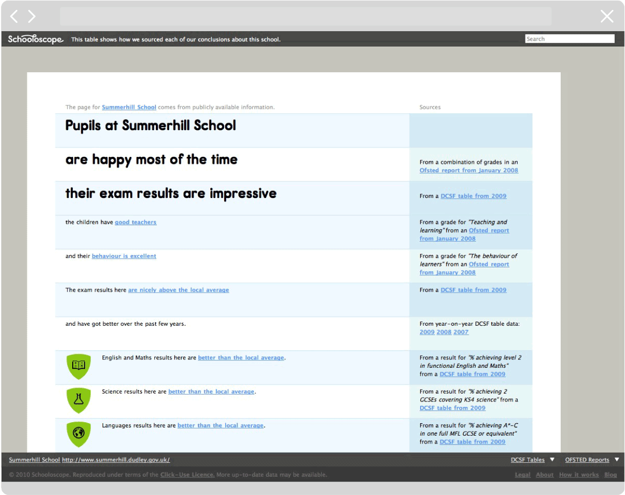
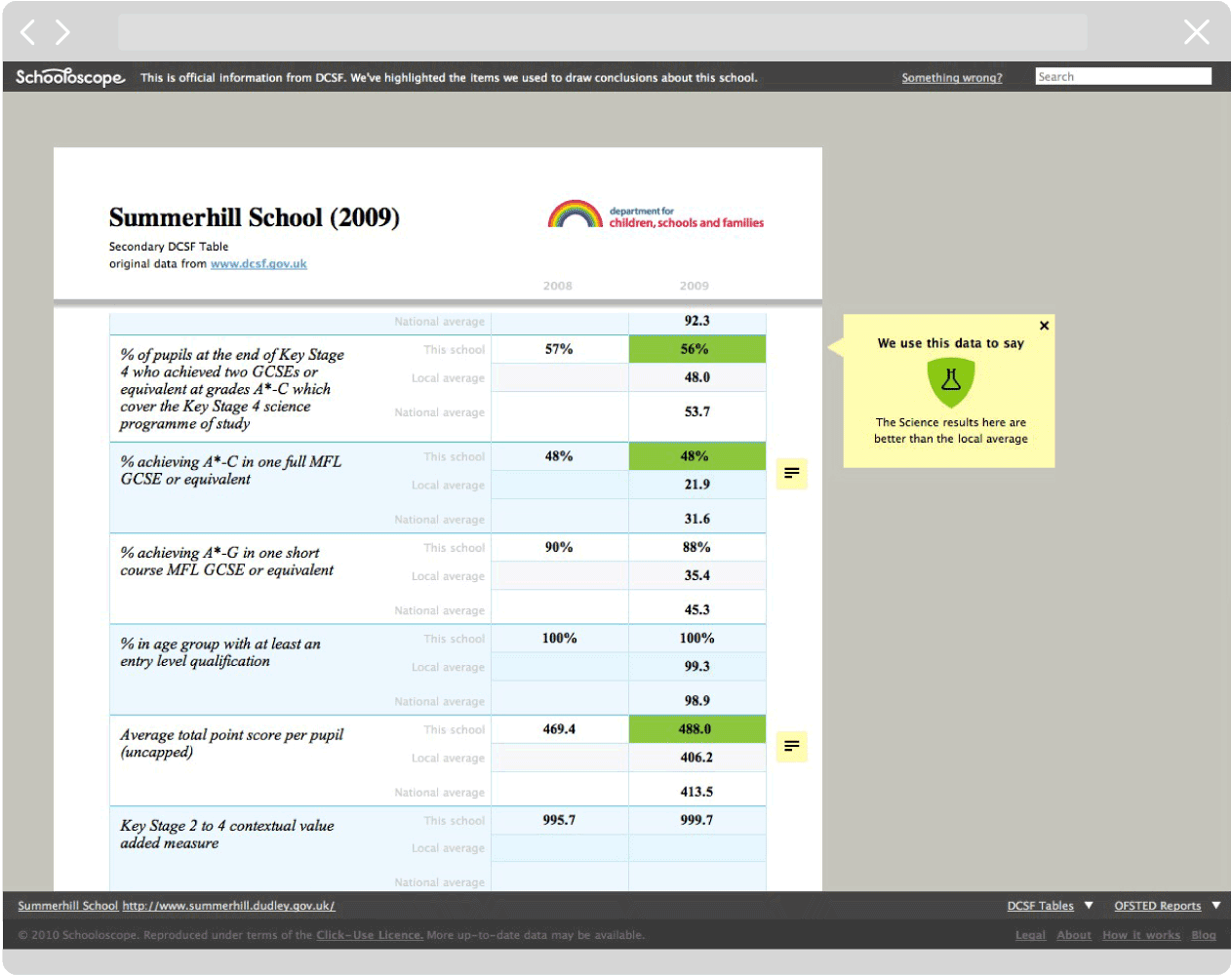
Another phrase that stuck around during reviews was how to make the site feel like two parents chatting at the school gate. Schooloscope avoided using needlessly precise numbers on a school’s overview page, instead using data to generate simple, conversational summaries about how each school was doing. This was a great introductory hook, allowing us to layer and gradually reveal more detailed information at every click.
Happiness versus Results
One of our meatier tasks was to communicate that the success of a school is about much more than test scores. As well as knowing about academic achievement, how might we get a sense of how happy the kids are?
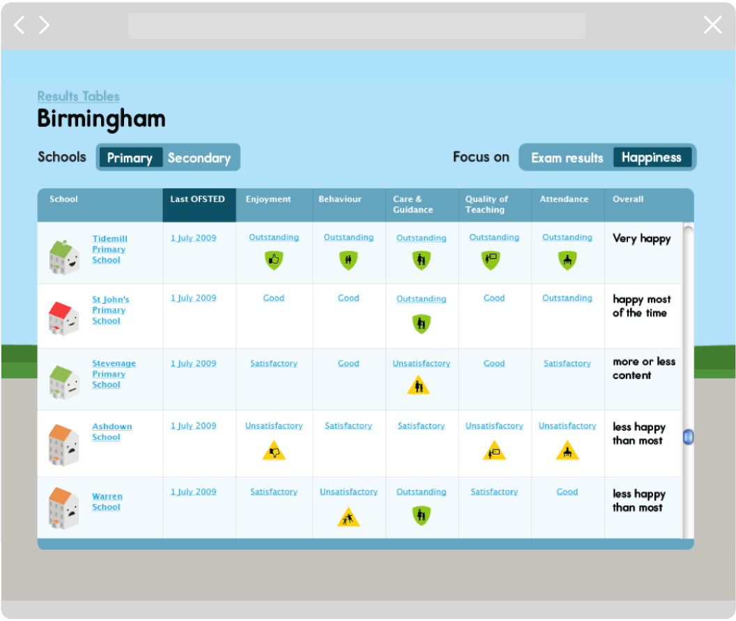
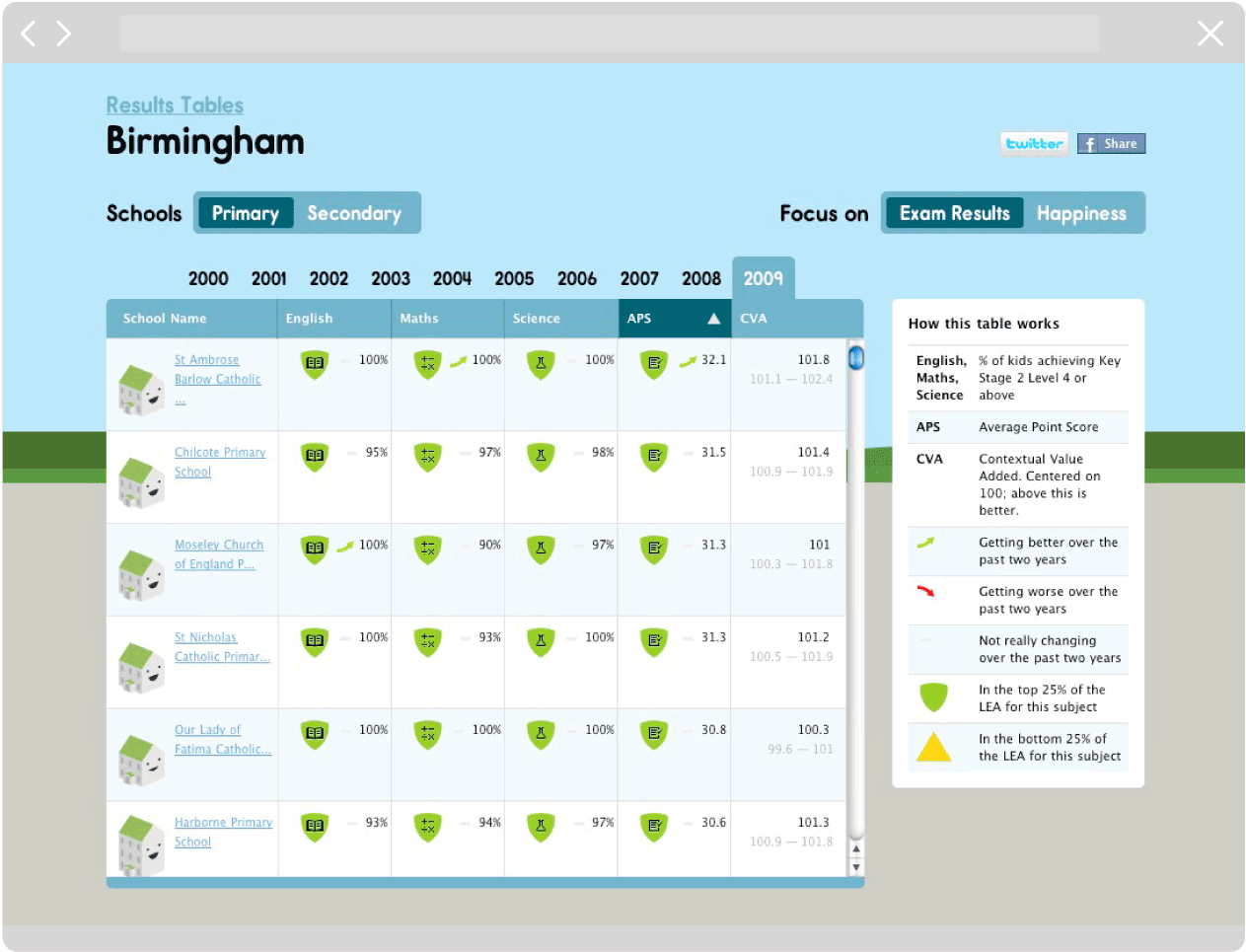
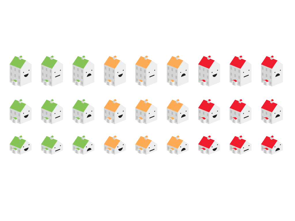
Our approach involved blending a few Ofsted metrics for each school – Care and Guidance, Quality of Teaching, Pupils’ Enjoyment, Behavior, and Attendance. We visualized this as a smiling (or sad, or neutral) face on the side of each school’s icon, alongside roof color (academic achievement), and number of floors (school size), a technique we borrowed from Herman Chernoff.
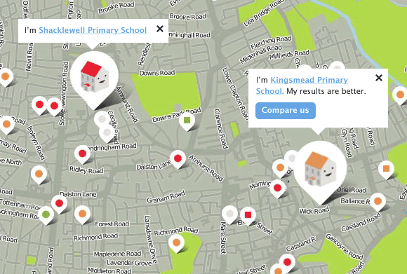
For my money, this worked almost too well, eclipsing the subtler, more complex parts of the site. Seeing a ‘sad’ school amidst a sea of happier ones provoked hugely visceral responses that (rightly) led to deeper debate – not only about how we visualized the data, but about how government data itself is collected, accessed and used.
Design beyond Dataviz
In the near decade since Schooloscope launched, we’ve seen more and more evidence that effective use of data improves public services. We’ve seen the growth of fantastic organizations like Code for America, the USDS, 18F, and the Data Quality Campaign, and we know the impact that good design can have on shaping better government.
Designing with data goes beyond making information more approachable and legible. It also involves looking at why and how this data is collected in the first place, and making sure the services around it have transparency, safety and trust at their core. If we’re designing with kids in mind, this is even more important. As a design studio focused on learning and play, this is core to what Extraordinary Facility does.
With that, I’m really looking forward to meeting some like-minded folk down in DC next week, and seeing what emerges!